Watson Analytics
Dean Compher
22 June 2015
Watson Analytics is an interesting new tool that you should try right away. It is free and you don’t have to install anything. You can just sign up for the service and start seeing your data in new and interesting ways. It is a great way to get your hands on Watson technologies like natural language processing that is filtering into many of IBM’s analytics products. You can add any Microsoft Excel file or comma separated values (CSV) file to begin getting new perspectives on your data and even be shown which fields are highly correlated to fields that interest you. Best of all you don’t need to create any formulas or tell Watson Explorer how to do it, instead you ask questions in natural language and the tool takes care of creating graphs to answer you. You can use any data you like. While it is meant for business data you can use anything you have or can find on the web such as football statistics, real estate data, weather, or automobile files. So if you don’t have a file with information that interests you, then just search the web for your interest and the term “csv file”. Just get a file and get started. This stuff is fascinating. In this article I will discuss what you can do with Watson Analytics and help you get started.
There are four major types of activities you can do with your data - Explore, Predict, Assemble and Refine as you can see from the welcome screen displayed immediately after logging into Watson Analytics and shown in figure 1.
Figure 1. Watson Analytics Welcome page.

Explore allows you to ask questions as you would in a forum or to another person and even displays questions that you could ask as soon as you enter the explore feature based on interesting combinations of data that Watson Analytics found in your file. Answers to your questions will be displayed in a graph or map and you get the ability to change the type of graph. Predict allows you to pick a field that is of interest to you and Watson Analytics will show which other field or set of fields predict the data in your target field. Not only will it tell you which fields predict this target, but it also gives you the level of confidence of each prediction. It also shows a data quality score for the data in the file you uploaded and lets you drill into the details of how it determined that score. I will mostly discuss the Explore and Predict aspects of Watson Analytics. Refine allows you to view your uploaded data in a tabular format and make changes to it. Assemble allows you to put the graphs and findings together into a report.
In the next sections I will show you a possible road map for trying some of the great features of Watson Explorer. When I am first trying something new I like to have an example that I can follow, so that is what I provided here. Once you go through some or all of it, you will start to get a better understanding of how to use the tool and you can then find your own path and use different features. It should be noted that in a number of examples I tell your how to navigate to a particular function. Frequently, there are other ways to get there and the one I show may not be the best in all circumstances. Like many cloud applications, this one is being developed using the agile mythology. This means that it is frequently changing and adding new features, so the screens you see may look different than the ones I’ve captured here.
Getting Started
This is a cloud based application that you access through a web browser, so you just need to sign up for the service using your IBM ID. Your IBM ID is the one you use for opening on-line PMR’s, downloading software, and things like that. If you don’t have one you can get one. In either case, just go to the Watson Analytics main page and enter your e-mail address and then click the “Start now” button next to it. You will be prompted to add your registration information and an IBM ID will be created for you if you don’t already have one. A few minutes later you will get an e-mail confirming you are enrolled and you can start using Watson Analytics. You can now go back to the main page and click sign-in to log on.
The first thing that you need to do to begin using Watson Analytics is to upload a file or set of files. The free version of Watson Analytics allows you to upload files with up to 50 columns and 100,000 rows. The maximum total combined sizes of your files can not exceed 500 MB. The paid editions allow more columns, rows and space. Each file that you upload will be called a “data set” when working in Watson Analytics, and will have the name of the file you uploaded. I highly recommend that the first record in the file have column names. This allows Watson Analytics to know which fields you are referencing when you ask questions. To upload a file click the “+Add” button that you can see on the bottom center of figure 1 above. From here you can drag you file onto the dialog or click the “Drop your file here or tap to browse” button and follow the prompts to browse for your file. The “Upload data” button allows you to upload data from certain cloud sources like Dropbox, and can even be configured to extract data from your dashDB database. For the examples below, I uploaded a file called RealEstate.xls and my copy of the data in Watson Analytics (data set) is now called RealEstate. I have an interest in real estate, so I got a file containing a month of statics about houses sold in Salt Lake County, Utah. My original spreadsheet was more than 50 columns wide, so I deleted some of them to get down to 50. However, when I tried to upload the edited file, I still got the “too many columns” error. To get around that I pasted my 50 columns into a different spreadsheet and then it worked.
In this article I will always have you begin from the welcome screen that you get when you first log in. As you are learning Watson Analytics, it is easy to get lost, but you can always get back to the welcome screen navigation by clicking on the down arrow at the top of the screen next to the process you are executing as shown in Figure 2. In this diagram I show that I am working with the “RealEstate” file and that I am in the Explore function. As you can see in figure 2, I have clicked the arrow next to my function and I only need to click the “Welcome” item in the dropdown menu displayed to get back to the Welcome screen.
Figure 2. Navigate Back to Welcome Screen.

Examining the Data

The first thing that I recommend after uploading a file is clicking the orange “Refine” box on the welcome screen. Then choose the file you uploaded when prompted. This will display the data you uploaded in a tabular format showing the column names from the first record in the file as the column names of your Watson Analytics data set. Here you can review the data to make sure columns are under the right headings and that everything looks as it should. I think that you can make changes here, but I have not tried that.

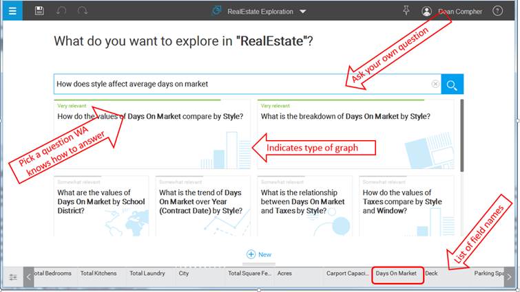
Once you have seen that your data was uploaded correctly, you can then explore your data bay clicking the “Explore” box on the welcome screen and clicking your data set when prompted. You will be presented with a number of questions that Watson Analytics thinks might interest you as shown in figure 3. Even if none of the questions presented interest you, try clicking on some of them just to see some of the types of graphs Watson Analytics can create. To get back to the list of questions (main explore screen) click the arrow on the right side of the graph screen as you can see in figure 4. Now go back to the main explore screen (figure 3) with the set of questions. Look at the bottom of the screen and you will see the names of the fields of your data set. Smaller dots above a field mean more unique values (higher cardinality) in it. Next ask your own question in the search box on the main explore screen. Make sure to use the field names from your data set in your question to ensure that Watson Analytics knows which ones you are referencing. In my exploration of my RealEstate file I asked the question “How does style affect average days on market?” and then Watson Analytics presented similar questions it could answer, with each box showing the type of graph that it would display in the box with the possible question as shown in figure 3.
Figure 3. Main Explore Screen.
By clicking the “How do the values of Days on Market compare by Style?” question, I was presented with the graph shown in figure 4. The graphs shows some interesting things like the fact that 2-story houses spent longer on the market than Bungalows, but you can do much more. You could view the data in a number of other graph styles by clicking the graph styles button and choosing the style you prefer. You could change the function used for days on market from average to sum, count or something else by expanding the Columns heading, right clicking “Days on Market”, clicking the Summarize option and finally choosing the summarization you want. You can do several other things like hovering over the bars on the chart to see exact averages. Try clicking and hovering and see what you can find. To ask another question, click the arrow on the right side of the screen.
Figure 4. Example Watson Explorer Graph

There are many more things that you can do with data exploration and I urge you to explore all the things you can do with this feature.

In addition to exploring your data, you can see how the values in one set of fields “Predict” the value of another field. To do this you choose a target field or a set of fields and see what other fields are correlated to them and how highly they are correlated. You can drill into the predictions to see what type of algorithm was used such as regression or clustering and explore more interesting details about the predictions that Watson Analytics made for you. To begin your prediction from the welcome screen, click the Predict button and then choose your data set. You will then be prompted to choose a name for your prediction and the select the target columns. You can choose one or a few. You then click the “Create Prediction” button and Watson Analytics will analyze the data to find what predicts this field.
You will then be presented with a number if interesting facts, but the most important one is the spiral graph you can see in the middle. The target field is shown in the center with a spiral spinning away from the target. Each dot on the spiral is a field or set of fields that predicts the target. The closer the dot, the better it predicts target. You can hover over each dot to see which field(s) it represents and how closely it is correlated to the target. It also provides additional data about what other fields might be an even better predictor. Predictive strength of each dot is also shown in more detail in the graphs on the right, shown with a matching color. You can see this in figure 5.
Using my RealEstae file the single field that was most predictive of sold price was list price. That is not very interesting, but I would not have had much confidence in the tool if it had not found that. What was more interesting was that the combination of list price and sold terms (cash, conventional loan, seller financing, etc.) was an even stronger predictor. Another thing that is very useful is to see how Watson Analytics scores the quality of the data in your files. You can click the score box to get more details on how it determined your data quality score. Things like missing values, fields that only have a few unique values and skewed distributions of data impact data quality. This may not be a problem for your particular data set, but it is good to review for better insights into your data. Again there are many more things that you can do with the predict option and you should try them.
Figure 5. Prediction

I actually enjoyed experimenting with Watson Analytics and I think that you will too. I summarized some of the more interesting, but basic things you can do in this article, but there is much more that you can be done to examine your data. I urge everyone reading this to give it a try. It is easy to get started and you don’t need to install anything. I believe that you will be impressed. There are a number of places where you can get more information about how to use Watson Analytics and what you can do with it.
|
Link |
Description |
|
See videos about what you can do with Watson Analytics along with how-to videos. |
|
|
You must be logged into your Watson Analytics account to use this link. It shows documentation for using Watson Analytics. It can also be reached by clicking the “?” in the upper right of the screen. |
|
|
Open to all. This is a space that also has documentation, an expert blog, a discussion forum, tips and other useful features. |
|
|
When you are logged into the welcome screen of your Watson Analytics account just scroll down to see links to videos for things like how to load data. |
Twitter Data
To this point I have only showed things that you can do in the free edition. One of the most interesting features in the paid editions is the ability to extract Twitter data and do all of the analysis I describe above plus everything else you can do in Watson Analytics. Because of the partnership between IBM and Twitter you just can just enter one or a set of hashtags that are of interest to you such as #db2 and Watson Analytics will extract a subset of tweets with those hashtags and will create a data set for you just like it did for the file that you can upload yourself. In addition, the extract process uses some of IBM’s text analytics features to add sentiment data to the data set. That’s right you can use Watson Analytics to see if there is sentiment about you hashtags and whether it is positive, neutral, or negative, and graph the trend over time! Figure 6 shows a graph sentiment for #db2 tweets over the May 25-31 timeframe. I’m not sure why the tweets spiked on May 27, but I would be interested in finding out. What could your organization do with this sort of sentiment information about your products? With Watson Analytics you can find out quickly.
Figure 6. Twitter Data.

With any of the paid editions, you only need to go to the “+Add” function from the welcome screen as described above in the Getting Started section. In the Add dialog you merely click the “Upload Data” button and choose Twitter from the list. You will then be prompted for the hashtags you want and Watson Analytics does the rest for you.
Why is this product called Watson Analytics? As you can see it does analysis, but it also includes a number of features developed in the Watson Lab. One of those features is the natural language processing feature used to process your questions and determine which graphs make sense. This is not a trivial function. Another Watson feature is the type of text analytics that can determine sentiment from a tweet. These advanced features are quickly filtering into many of IBM’s analytics products, so you don’t need the full Watson system to get Watson features.
To see a list of what the features you get with each edition, just log into your Watson Analytics welcome page and click your name in the upper right of the screen. Pick the “Upgrade” menu option. This will display a chart of the edition and a list of what you get with each. You can close this window without actually upgrading.
***
Since this tool is so easy to use I suggest that you find a file of information that interests you and get started right away. It does not matter whether you are using business or personal data. You will not regret it. I am really interested in hearing the fascinating things that you find. Please post them to my Facebook Page or db2Dean and Friends Community. I’m especially eager to hear if anyone was able to improve their standing in a fantasy sports league using Watson Analytics’ predictive function!